


One of the challenges I had with mapping church presence is that Ireland looks different depending on the level at which you view it. I have been thinking about it like a plane flying over a region. We might see field and roads, the lights of a city or waves off the coast. Of course, that is true of almost any map, of course, but it becomes especially important when we are thinking about mission. A national picture can be useful, but it can also narrow the field that we view reality. A county can look well supplied with churches while still containing towns, villages, or rural communities where there is a lack of Gospel witness. A local area can look empty until you realise there is a church just across a boundary a few miles away. A town can seem isolated when, in reality, it functions as part of a wider commuter or settlement pattern. Scale changes what you see.
That is why the Glúnta Church Map includes several geographic layers to help us process not only where the churches are, but where they are in relation to people and gaps.
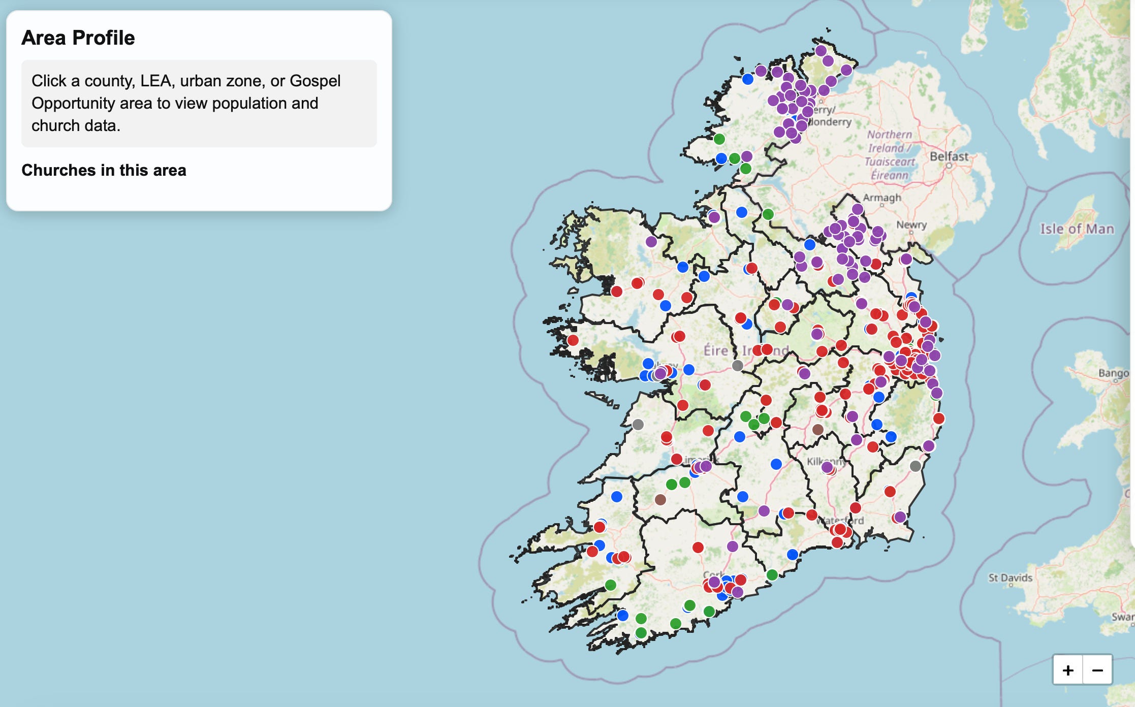
The county layer gives the broadest view. It allows us to step back and look at the Republic as a whole in county terms. This is helpful because counties are familiar. People know where Galway, Mayo, Cork, Kerry, Donegal, Dublin, or Waterford are. Counties have a place in our imagination, our speech, our sporting loyalties, our sense of identity. They are a useful starting point for seeing the national spread of church presence. Each county on the map has a profile that includes the churches present, how many people as per the last census, and also, the churches that are currently present.
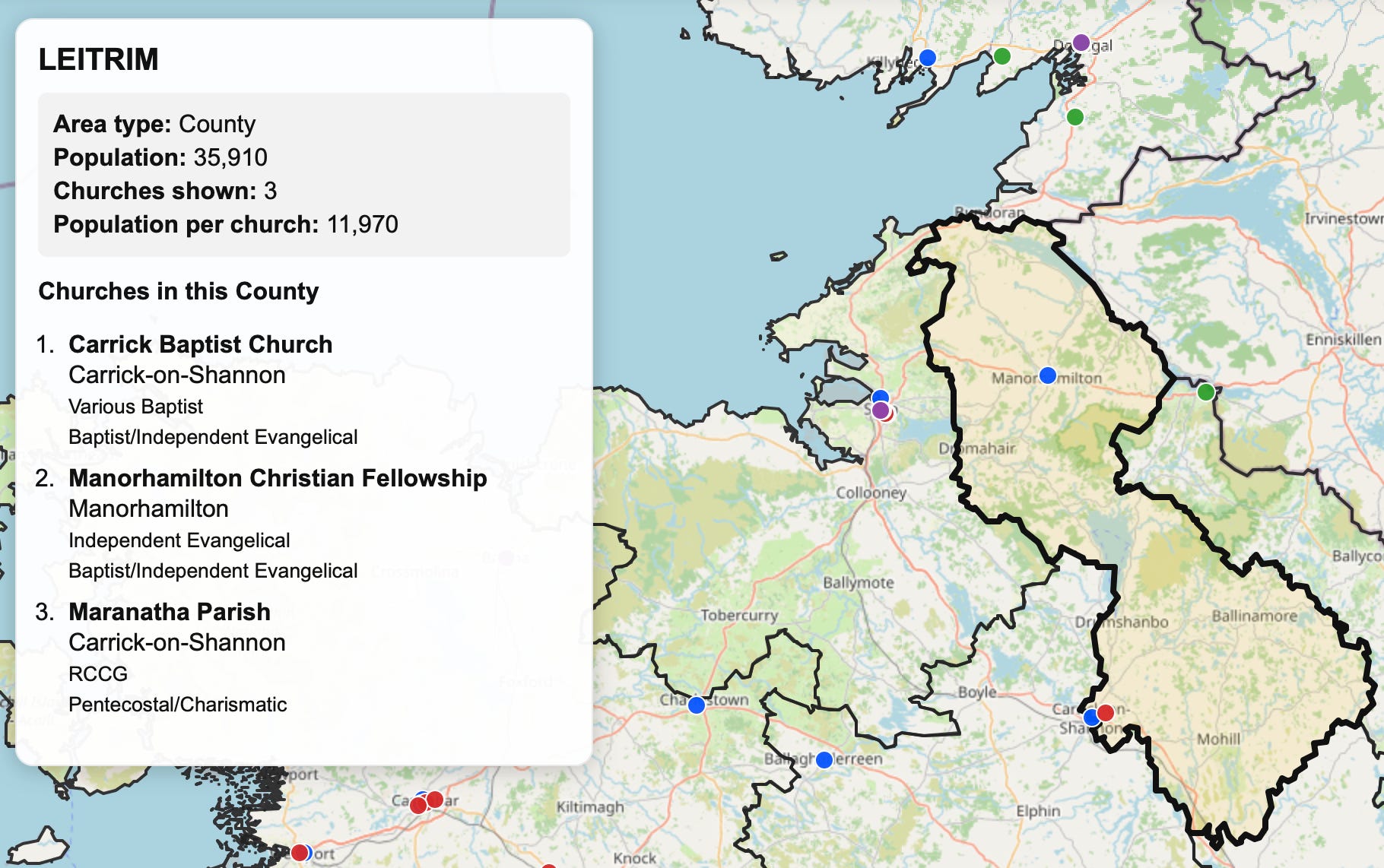
The weakness of county-level thinking alone is that counties are fine for a broad view, but we need to zoom in a little. A county may have a decent number of churches on paper, but those churches may be clustered in one part of the county. Another county may appear lightly served, yet have one or two congregations positioned in strategic towns. If we only count churches by county, we risk missing the unevenness within the county itself.
This is where the LEA layer becomes useful.
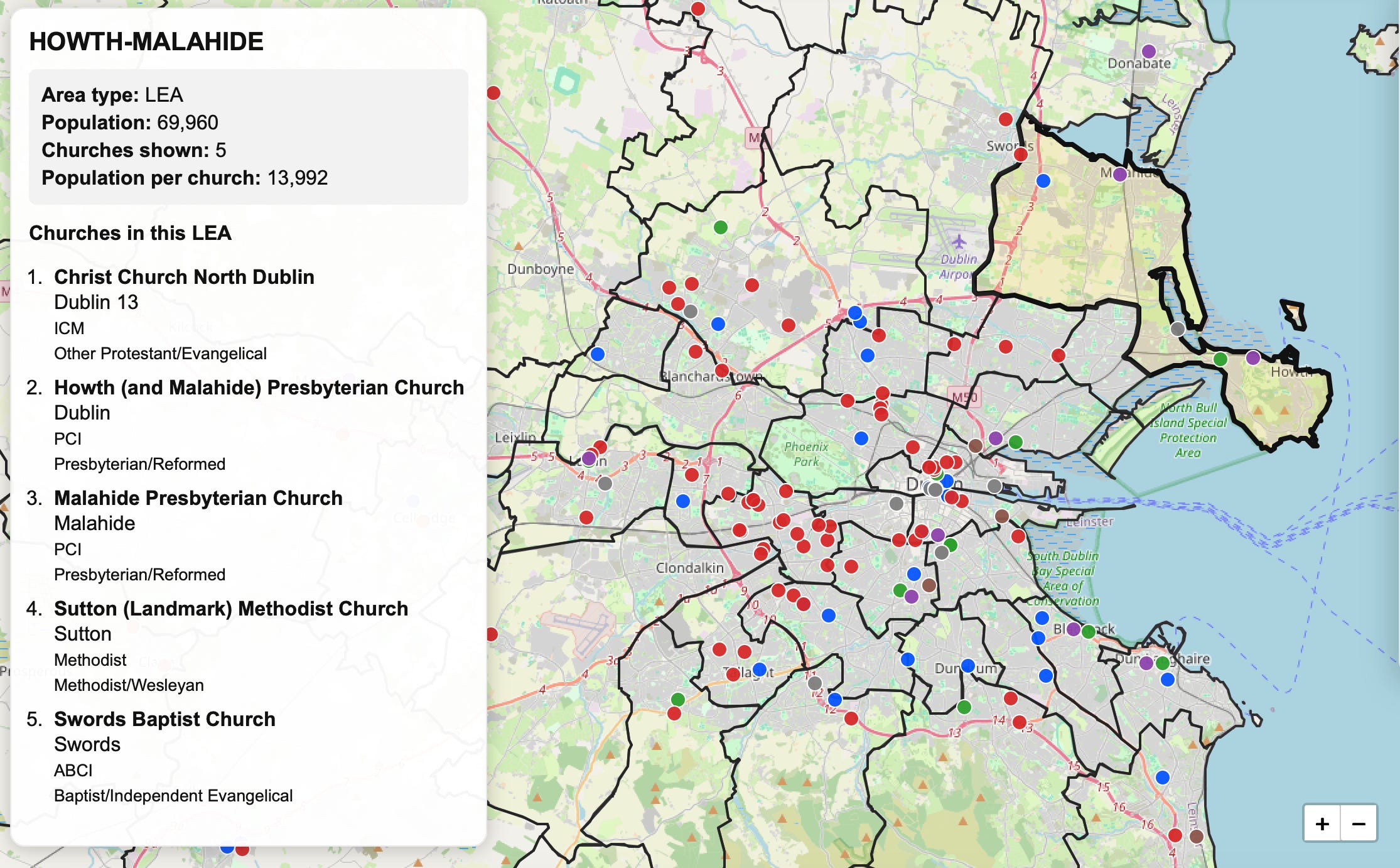
LEA, or Local Electoral Areas are not natural mission categories. Nobody introduces themselves by saying, “I live in the Loughrea LEA” or “I’m from the Howth-Malahide LEA.” These are civic boundaries, but they do zoom in on more local identities as they help us see at a more local level than counties allow. They divide the country into smaller areas, which means they can reveal patterns that disappear when everything is folded into a county total. It also helps us to see that in Dublin, even with by far the largest population of people and concentration of churches, that there still are areas that are without a church presence.
An LEA may contain a main town, several villages, rural environs, newer housing, older communities, schools, roads, shops and local services. It may have no visible church presence at all, or it may have one small congregation serving a much wider area than the map shows. Looking at LEAs helps us ask more careful questions. Where exactly is church presence located? How far is it from other populated places? Are there local areas where the only visible evangelical witness is fragile or distant?
Then there are Urban Zones.
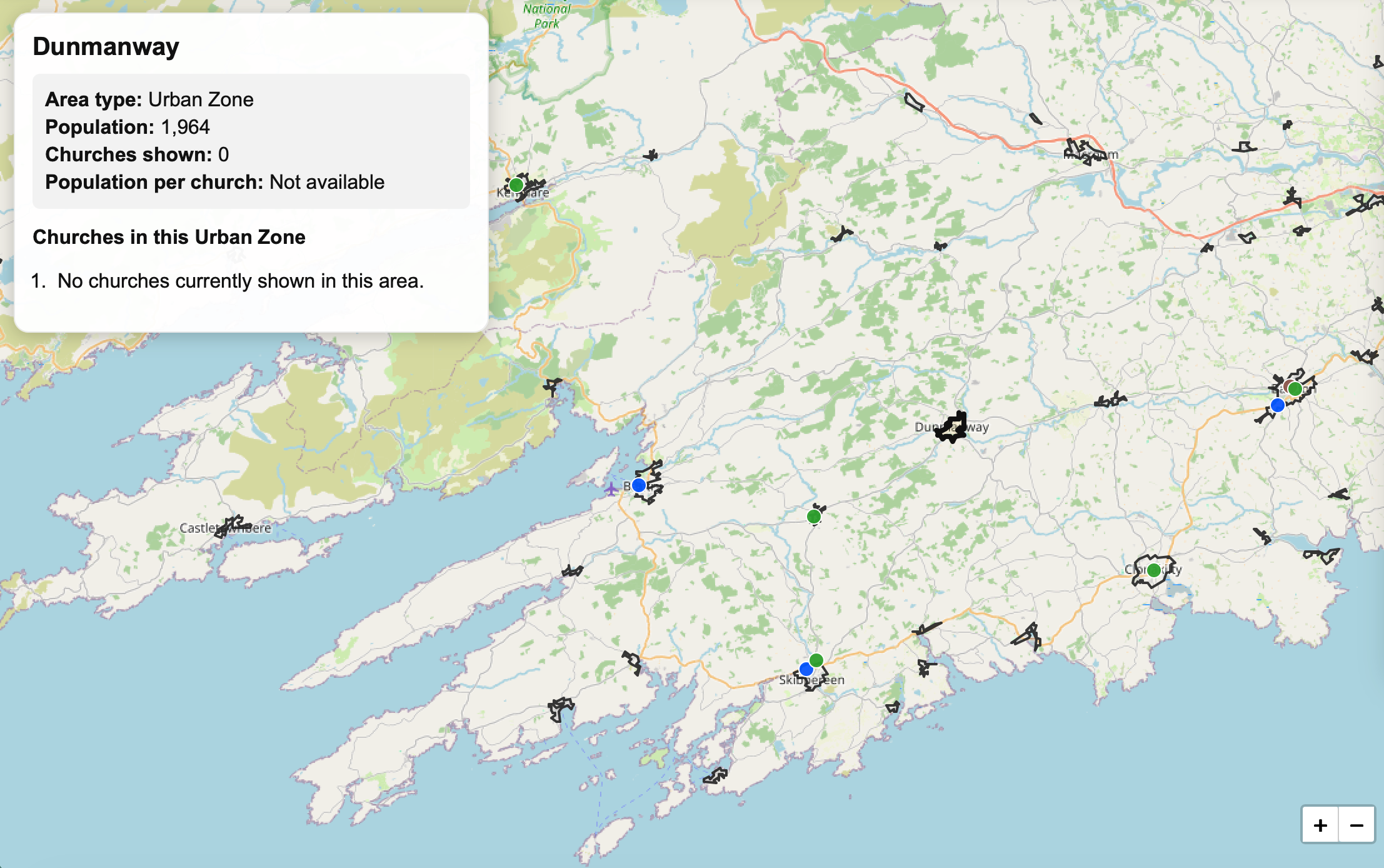
The Urban Zone layer is of interest because people do not live inside neat administrative categories. They live around towns, roads, schools, shops, workplaces, sports clubs, and family connections. A town may serve a much wider population than the town boundary suggests. People commute into it, shop there, attend school there, visit the doctor there, and form a practical sense of local belonging around it. This is especially true in our modern commuter economy and social structure. So in some ways this provides a vital insight for mission. Not where spaces are, but where people are inside those spaces. In future, I hope to develop a better understanding of the demographics within these spaces.
The Urban Zones layer tries to help us think about those more lived patterns of settlement. It pushes our questions beyond “Which county is this in?” or “Which LEA is this in?” and asks instead, “Where are people actually gathering their lives?” In some cases, a church in the right town may serve not only the town itself, but surrounding villages, farms, estates, and commuter communities. In other cases, a population centre may appear more isolated than we had assumed. What’s key to understand it that none of these layers tells the whole story by itself.
The county layer helps us see the national spread. The LEA layer gives us a more local picture. The Urban Zones layer helps us think about towns and settlement patterns. Together, they allow us to move in and out, to change the scale, to inform better decisions on where to plant churches.
That is important because mission strategy often suffers when we only look at one level. If we only look nationally, we become vague. If we only look locally, we may miss wider patterns. If we only look at towns, we may overlook rural areas. If we only look at administrative boundaries, we may miss how people actually live. I was very keen on creating a map that wasn’t only showing dots, nice colours and geographical boundaries, but to help us understand the scale of the questions we are asking.
Where is church presence visible at a national level? Where does the local picture look different? Which towns seem to function as wider centres? Where might a single church be serving a much larger area than we realise? Where might a county total hide a need in the smaller settlements within it’s borders?
The further we get into it, the more (and hopefully better!) questions we will ask. On Friday we’ll look at the part of the mapping process that I’m most excited about!
On the following Tuesday (26th May) I’ll be hopefully doing a bit of a Q&A on the map, and trying to answer any questions that you guys might have before launch on the 29th. If you have a question, send it to me in the comments, or on social media, and I’l seek to answer them in next week’s post.